
Background
This work was somewhat motivated by a post I read on another interesting data science blog; its combination of network graphs and football seemed both accessible and visualing appealing. Due to the profileration of social media and technological advances, graph/network based approaches are becoming more common. Graph theory has been employed to study disease propagation, elephant rest sites, relationships in The Simpsons and even MMA finishes, so I wanted to try it out for myself.
I watch alot of English Premier League (EPL) football, so I’m actutely aware of its reputation as the Most Competitive league in the world, (formerly, the Best League in the World). I’m not aiming to compare the quality of each league (UEFA coefficients solves that problem), but rather determine whether the leagues themselves are becoming less competitive. This decade has seen the rise of foreign owned super rich clubs across Europe (Man City, PSG) and the domination of domestic championships by a small elite (Bayern Munich in Germany, Juventus in Italy). Then again, just last year, relegation favourites Leicester City won the EPL, so maybe the EPL has become more competitive than ever.
I suppose we need to quantify the competitiveness of a league. We’ll use two approaches: one based on graph theory and another more conventional statistical approach. I’m not particularly expecting the former to beat the latter, I just wanted an excuse to build a network graph populated with football teams.
Gathering the Data
There are numerous free sources of football data (well, at least for the major European leagues- you might struggle with the Slovakian Third Division or the Irish Premier Division). There’s a good summary here. And if you’re interested in R API wrappers, there’s the footballR package. As we want to look at historical trends within leagues, we’ll choose the csv route (APIs generally go back only a few years). The data will be sourced from this site. No need to download the files, we can import the data directly into R using the appropriate URL. Let’s start with the last year of Alex Ferguson’s reign as Man United manager (2012-13 EPL season).
#loading the packages we'll need
require(RCurl) # import csv from URL
require(dplyr) # data manipulation/filtering
require(visNetwork) # producing interactive graphs
require(igraph) # to calculate graph properties
require(ggplot2) # vanilla graphs
require(purrr) # map lists to functions
options(stringsAsFactors = FALSE)
epl_1213 <- read.csv(text=getURL("http://www.football-data.co.uk/mmz4281/1213/E0.csv"),
stringsAsFactors = FALSE)
head(epl_1213[,1:10])
## Div Date HomeTeam AwayTeam FTHG FTAG FTR HTHG HTAG HTR
## 1 E0 18/08/12 Arsenal Sunderland 0 0 D 0 0 D
## 2 E0 18/08/12 Fulham Norwich 5 0 H 2 0 H
## 3 E0 18/08/12 Newcastle Tottenham 2 1 H 0 0 D
## 4 E0 18/08/12 QPR Swansea 0 5 A 0 1 A
## 5 E0 18/08/12 Reading Stoke 1 1 D 0 1 A
## 6 E0 18/08/12 West Brom Liverpool 3 0 H 1 0 H
For each match in a given season, the data frame includes the score and various other data we can ignore (mostly betting odds). First, we must think about our network. Networks are composed of nodes and edges, where an edge connecting two nodes indicates a relationship. In its simplest form, think of a network of people, where two nodes are joined by an edge if they’re friends. We can have either undirected or directed networks. The latter means that there’s a direction to the relationship (e.g. following someone on Twitter does imply that they follow you, which contrasts with Facebook friends). We’ll keep things simple, so we’ll opt for an undirected graph.
The nodes are the 20 teams of 2012-13 EPL season, but what are the edges? Using the epl_1213 data frame, we’ll say two teams are connected if each team gained at least one point in the two matches they played against each other (teams play each other both home and away in Europe’s major football leagues). Equivalently, two teams are not connected if one team won both encounters. We can imagine how our network will look. The big teams should have fewer connections as they are more likely to have beaten their opponents both home and away. Similarly, the weaker teams will be less conencted, as they will have lost regularly. In the middle, we’ll have teams that didn’t regularly defeat the poor teams, but were resilient against the bigger teams.
Our next step is to reconstruct our data frame as a set of nodes and edges.
#convert data frame to head to head record
epl_1213 <- epl_1213 %>% dplyr::select(HomeTeam, AwayTeam, FTHG, FTAG) %>%
dplyr::rename(team1=HomeTeam, team2= AwayTeam, team1FT = FTHG, team2FT = FTAG) %>%
dplyr::filter(team1!="")
epl_1213 <- bind_rows(list(epl_1213 %>%
dplyr::group_by(team1,team2) %>%
dplyr::summarize(points = sum(case_when(team1FT>team2FT~3,
team1FT==team2FT~1,
TRUE ~ 0))),
epl_1213 %>% dplyr::rename(team2=team1,team1=team2) %>%
dplyr::group_by(team1,team2) %>%
dplyr::summarize(points = sum(case_when(team2FT>team1FT~3,
team2FT==team1FT~1,
TRUE ~ 0))))) %>%
dplyr::group_by(team1, team2) %>% dplyr::summarize(tot_points = sum(points)) %>%
dplyr::ungroup() %>% dplyr::arrange(team1,team2)
head(epl_1213)
## # A tibble: 6 × 3
## team1 team2 tot_points
## <chr> <chr> <dbl>
## 1 Arsenal Aston Villa 4
## 2 Arsenal Chelsea 0
## 3 Arsenal Everton 2
## 4 Arsenal Fulham 4
## 5 Arsenal Liverpool 4
## 6 Arsenal Man City 1
With a bit of dplyr, we’ve completely reformatted our csv as something approaching a network. For example, Arsenal gained 4 points against Aston Villa, but lost both matches to Chelsea. Remember, we want to exclude teams who lost/won both matches, so we filter out rows with 0 or 6 points. We also remove duplications (we make no distinction between Arsenal -> Aston Villa & Aston Villa -> Arsenal). Okay, we’re ready to construct our nodes and edges. Just note that most graph packages in R require specific column names for node and edges data frames (the various network visualisation packages in R are extensively described in this great tutorial).
# construct nodes
nodes <- dplyr::group_by(epl_1213, team1) %>%
dplyr::summarize(value = sum(tot_points)) %>%
dplyr::rename(id = team1) %>%
dplyr::inner_join(crests, by=c("id"= "team")) %>%
dplyr::arrange(desc(value)) %>%
dplyr::mutate(shape="image", label = "",
title = paste0("<p><b>",id,"</b><br>Points: ",
value,"<br>Position: ",row_number(),"</p>"))
head(nodes)
## # A tibble: 6 × 6
## id value
## <chr> <dbl>
## 1 Man United 89
## 2 Man City 78
## 3 Chelsea 75
## 4 Arsenal 73
## 5 Tottenham 72
## 6 Everton 63
## # ... with 4 more variables: image <chr>, shape <chr>, label <chr>,
## # title <chr>
# construct edges
edge_list <- epl_1213 %>% dplyr::filter(as.character(team1)<as.character(team2)) %>%
dplyr::filter(!tot_points %in% c(0,6)) %>%
dplyr::rename(from=team1,to=team2,value=tot_points) %>% dplyr::select(from, to)
head(edge_list)
## # A tibble: 6 × 2
## from to
## <chr> <chr>
## 1 Arsenal Aston Villa
## 2 Arsenal Everton
## 3 Arsenal Fulham
## 4 Arsenal Liverpool
## 5 Arsenal Man City
## 6 Arsenal Man United
We have a set of nodes with some supplementary information (for example, the value column represents the number of points won by that team- it will determine the size of node in the graph). The edge_list data frame is relatively intuitive, each row will create a line/connection between those two teams. We can now visualise the network graph using the visNetwork package.
# plot network graph
visNetwork(nodes,edge_list,main = "EPL 2012-13 Season",width="800px") %>%
visEdges(color = list(color="gray",opacity=0.25)) %>%
visOptions( highlightNearest = TRUE, nodesIdSelection = TRUE) %>%
visEvents(stabilizationIterationsDone="function () {this.setOptions( { physics: false } );}") %>%
visLayout(randomSeed=91)
I admit it’s not as visualling stunning as I hoped it would be (how many times have I heard that one???). Some crests are indecipherably bundled on top of each other. Feel free to move the nodes around (one of the perks of using visNetwork). But it somewhat recreates what we expected: the big and small teams are positioned on the extemities, while mid table teams are clustered tightly in the centre. To study graph properties (e.g. connectedness), we’ll switch to the igraph package (note: igraph can also produce network graphs, they just won’t be interactive). Again, we just pass the function our set of nodes and edges.
To measure the centrality of a node, we can choose from several algorithms (conveniently summarised in wikipedia). While the output will differ slightly, we want to rank nodes according to how important/central they are in the network (an analogous task would be finding the most influential person in a social network). The most simple concept is the degree of each node (the numer of lines joining each node). For example, we can plot the cumulative distribution of the node degrees.
# cumulative distribution of degrees
epl_igraph_1213 <- graph_from_data_frame(d=edge_list, vertices=nodes, directed=F)
degs <- rep(0, nrow(nodes)+1)
deg_dist <- degree_distribution(epl_igraph_1213, cumulative=T, mode="all")
degs[1:length(deg_dist)] <- deg_dist
plot( x=0:(length(degs)-1), y=1-degs, pch=19, cex=1.2, col="orange",
xlab="Degree", ylab="Cumulative Frequency", main= " Cumulative Frequency of EPL 2012-13 Degrees")
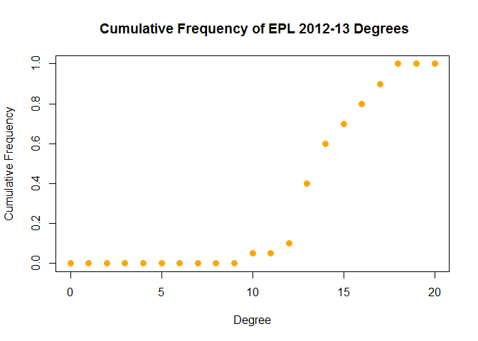
We could use this distribution to quantify the competitiveness of a league/season. For example, a higher mean/median degree would imply less significantly stronger/weakers teams. Before we continue with that thought, let’s establish the most central/competitive team in the 2012-13 EPL season. We’ll look at the betweeness (number of shortest paths containing that node) and a variant of eigenvector centrality called pageRank (it rewards nodes that are connected to highly connected nodes and was the underlying algorithm for the Google search engine).
# pageRank
data.frame(pageRank =
round(page_rank(epl_igraph_1213)$vector[order(-page_rank(epl_igraph_1213)$vector)],4))
## pageRank
## Everton 0.0617
## Norwich 0.0616
## West Ham 0.0585
## Stoke 0.0582
## Swansea 0.0552
## Fulham 0.0550
## Newcastle 0.0518
## Southampton 0.0517
## Tottenham 0.0490
## Man City 0.0488
## Liverpool 0.0487
## Sunderland 0.0484
## Chelsea 0.0458
## West Brom 0.0457
## QPR 0.0455
## Arsenal 0.0455
## Aston Villa 0.0454
## Reading 0.0453
## Wigan 0.0422
## Man United 0.0360
# betweeness
data.frame(betweeness =
round(betweenness(epl_igraph_1213)[order(-betweenness(epl_igraph_1213))],2))
## betweeness
## Everton 5.61
## Norwich 5.19
## West Ham 5.02
## Swansea 3.65
## Stoke 3.64
## Tottenham 3.43
## Fulham 3.24
## Chelsea 2.77
## Newcastle 2.66
## Southampton 2.60
## Liverpool 2.42
## Man City 2.35
## West Brom 2.29
## QPR 2.25
## Aston Villa 1.93
## Arsenal 1.86
## Sunderland 1.59
## Reading 1.57
## Wigan 0.96
## Man United 0.95
Congratulations to Everton (15 draws, 63 points, finished 6th), who won the ‘Most Competitive Team’ prize for the 2012-13 EPL season. The two approaches are in broad agreement, which is unsurprising, given our relatively simple network.
We’ll can take our graph theory approach to assess possible changes in the competitiveness of the EPL over the last twenty years (starting at the 1995-96 season, when the number of teams decreased from 22 to its current 20). The code is essentially wrapping our previous code in a loop, so I won’t present it here (full code can be found on github).
epl_data
## Season meanDegree pointSD Most_Competitive
## 1 1995-96 13.7 15.16193 Chelsea
## 2 1996-97 14.0 11.90522 Sheffield Weds
## 3 1997-98 13.9 12.43033 Coventry
## 4 1998-99 14.4 13.99953 Middlesbrough
## 5 1999-00 12.8 16.06369 Newcastle
## 6 2000-01 14.3 13.97168 Derby
## 7 2001-02 13.3 16.68745 West Ham
## 8 2002-03 13.3 15.32284 Bolton
## 9 2003-04 13.5 15.17755 Newcastle
## 10 2004-05 13.0 17.08339 Bolton
## 11 2005-06 11.7 18.61034 Middlesbrough
## 12 2006-07 13.0 15.85095 Everton
## 13 2007-08 12.0 19.73509 Wigan
## 14 2008-09 12.3 18.23610 Tottenham
## 15 2009-10 12.1 18.14445 Sunderland
## 16 2010-11 14.0 12.77940 Fulham
## 17 2011-12 12.9 17.43944 Wigan
## 18 2012-13 13.4 17.81897 Everton
## 19 2013-14 11.0 19.27338 West Brom
## 20 2014-15 12.9 16.34907 Stoke
## 21 2015-16 14.0 15.43842 Southampton
Already we’ve uncovered some interesting insights: Coventry used to be in the EPL. Data science continues to push the frontiers of human knowledge. Anyway, for each sesaon since 1995-96, we’ve returned the Most Competitive Team (mainly to maintain readers’ interest) and we’ve calculated the mean degree (meanDegree) and points standard deviation (pointSD). The former is our graph theory measure of competitiveness, while the latter is a more conventional mathematical approach (competitive seasons would have less variance in the final points tally of each team).
# correlation between the pointSD and meanDegree measures of competitiveness
cor(x = epl_data$pointSD, y = epl_data$meanDegree)
## [1] -0.8579008
No surprises there. Our two measures are heavily negatively correlated (a league with low pointSD would indicate a competitive league, as would a high meanDegree).
# plot historical competitiveness of EPL
ggplot(rbind(epl_data %>% dplyr::select(Season, meanDegree) %>%
dplyr::rename(value = meanDegree) %>% dplyr::mutate(measure="Mean Degree"),
epl_data %>% dplyr::select(Season, pointSD) %>%
dplyr::rename(value = pointSD) %>% dplyr::mutate(measure="Point SD")),
aes(x=Season, y= value ,color = measure,group=measure)) + geom_line(size=1) +
geom_point(size=2,color="black") + xlab("EPL Season") + ylab("Value") +
ggtitle("Historical Competitiveness of English Premier League") +
theme(axis.text.x = element_text(angle = 45, hjust = 1))
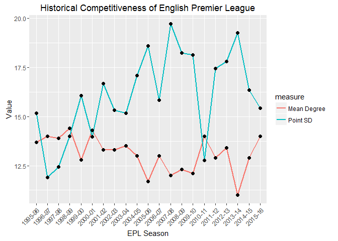
The correlation is clear from the above graph (when one goes up, the other goes down). The pointSD measure appears to have a wider range of values, the range of the meanDegree seems comparatively narrower. Note that the first few years displayed a sharp change in pointSD, while meanDegree remain relatively unchanged. Both measures suggest a decline in compettitiveness. Moving away from the pretty pictures, we’ll fit a simple linear model and check whether the slope is significantly different from zero (note: this relationship can’t be simply linear over longer timeframes, as there are theoretical limits to both measures (e.g. meanDegree varies between 0 and 19), but we should be safe over the small time period we’re considering).
# meanDegree linear model
summary(lm(meanDegree~Season,data=epl_data %>% dplyr::mutate(Season=1:nrow(epl_data))))
##
## Call:
## lm(formula = meanDegree ~ Season, data = epl_data %>% dplyr::mutate(Season = 1:nrow(epl_data)))
##
## Residuals:
## Min 1Q Median 3Q Max
## -1.61203 -0.62892 -0.00918 0.35134 1.51472
##
## Coefficients:
## Estimate Std. Error t value Pr(>|t|)
## (Intercept) 13.81619 0.37716 36.63 <2e-16 ***
## Season -0.06338 0.03004 -2.11 0.0484 *
## ---
## Signif. codes: 0 '***' 0.001 '**' 0.01 '*' 0.05 '.' 0.1 ' ' 1
##
## Residual standard error: 0.8335 on 19 degrees of freedom
## Multiple R-squared: 0.1898, Adjusted R-squared: 0.1472
## F-statistic: 4.452 on 1 and 19 DF, p-value: 0.04835
# pointSD linear model
summary(lm(pointSD~Season,data=epl_data %>% dplyr::mutate(Season=1:nrow(epl_data))))
##
## Call:
## lm(formula = pointSD ~ Season, data = epl_data %>% dplyr::mutate(Season = 1:nrow(epl_data)))
##
## Residuals:
## Min 1Q Median 3Q Max
## -4.2585 -1.1313 0.2081 1.3001 3.2777
##
## Coefficients:
## Estimate Std. Error t value Pr(>|t|)
## (Intercept) 13.94210 0.86528 16.113 1.55e-12 ***
## Season 0.19349 0.06891 2.808 0.0112 *
## ---
## Signif. codes: 0 '***' 0.001 '**' 0.01 '*' 0.05 '.' 0.1 ' ' 1
##
## Residual standard error: 1.912 on 19 degrees of freedom
## Multiple R-squared: 0.2932, Adjusted R-squared: 0.256
## F-statistic: 7.883 on 1 and 19 DF, p-value: 0.01123
According to both models (assuming a 95% level of confidence), the EPL has become less competitive. Note that the R2 score is relatively low (especially for the meanDegree measure), so there’s quite a bit of unexplained variance. Let’s switch our attention to the Spanish Primera Division (La Liga) to see if the picture is any clearer.
La Liga
La Liga is the home of Barcelona and Real Madrid, two undeniable giants of world sport that American readers may have even heard of. But it also includes Leganes and Eibar, two teams Spanish readers may not have heard of. This disparity means that La Liga is often labelled a two horse race (Atletico Madrid might have something to say about this). We can check whether such statements are supported by data. As before, the full code is available on github.
## Season meanDegree pointSD Most_Competitive
## 3 1997-98 13.6 13.00809 Espanol
## 4 1998-99 12.8 13.60447 Ath Madrid
## 5 1999-00 15.0 10.13280 Zaragoza
## 6 2000-01 13.8 12.50042 Zaragoza
## 7 2001-02 13.8 10.63002 Celta
## 8 2002-03 14.7 12.75219 Villarreal
## 9 2003-04 13.4 12.50211 Osasuna
## 10 2004-05 13.9 14.36003 Valencia
## 11 2005-06 13.5 14.67140 Zaragoza
## 12 2006-07 13.3 13.46692 Getafe
## 13 2007-08 13.0 14.24698 Mallorca
## 14 2008-09 13.2 14.51777 Valencia
## 15 2009-10 12.6 18.59789 Osasuna
## 16 2010-11 13.0 16.76925 Sp Gijon
## 17 2011-12 13.3 16.74295 Osasuna
## 18 2012-13 12.6 17.74854 Espanol
## 19 2013-14 12.2 18.28747 Valencia
## 20 2014-15 12.6 20.81365 Sociedad
## 21 2015-16 13.1 18.10321 La Coruna
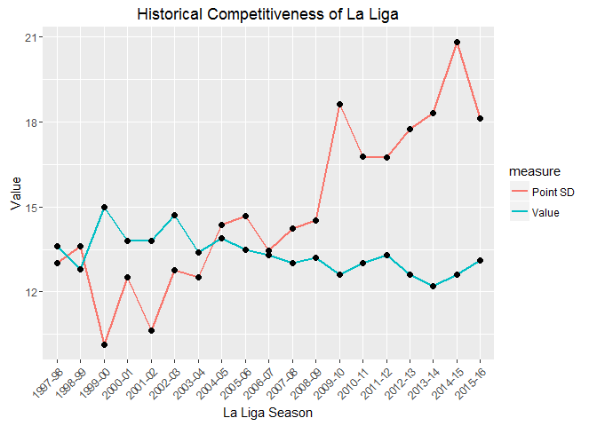
In the 1999-00 season, Deportivo La Coruna were the champions with 68 points, despite losing 11 matches (just 3 points seperated 2nd and 6th). This contrasts with the 2014-15 season, which was won by Barcelona with 94 points and 4 defeats (Deportivo’s title winning 68 points would have put them in 6th position). While the trend seems clear from the graphs, let’s fit a linear model to the data to determine whether La Liga is becoming less competitive.
# meanDegree linear model
summary(lm(meanDegree~Season,data=ll_data %>% dplyr::mutate(Season=0:(nrow(ll_data)-1))))
##
## Call:
## lm(formula = meanDegree ~ Season, data = ll_data %>% dplyr::mutate(Season = 0:(nrow(ll_data) -
## 1)))
##
## Residuals:
## Min 1Q Median 3Q Max
## -1.18947 -0.25132 -0.02632 0.22632 1.09211
##
## Coefficients:
## Estimate Std. Error t value Pr(>|t|)
## (Intercept) 14.07105 0.24385 57.705 <2e-16 ***
## Season -0.08158 0.02314 -3.525 0.0026 **
## ---
## Signif. codes: 0 '***' 0.001 '**' 0.01 '*' 0.05 '.' 0.1 ' ' 1
##
## Residual standard error: 0.5526 on 17 degrees of freedom
## Multiple R-squared: 0.4222, Adjusted R-squared: 0.3882
## F-statistic: 12.42 on 1 and 17 DF, p-value: 0.002601
# pointSD linear model
summary(lm(pointSD~Season,data=ll_data %>% dplyr::mutate(Season=0:(nrow(ll_data)-1))))
##
## Call:
## lm(formula = pointSD ~ Season, data = ll_data %>% dplyr::mutate(Season = 0:(nrow(ll_data) -
## 1)))
##
## Residuals:
## Min 1Q Median 3Q Max
## -2.03511 -1.09348 0.04762 0.31437 2.32698
##
## Coefficients:
## Estimate Std. Error t value Pr(>|t|)
## (Intercept) 10.86224 0.63220 17.182 3.53e-12 ***
## Season 0.45072 0.06001 7.511 8.52e-07 ***
## ---
## Signif. codes: 0 '***' 0.001 '**' 0.01 '*' 0.05 '.' 0.1 ' ' 1
##
## Residual standard error: 1.433 on 17 degrees of freedom
## Multiple R-squared: 0.7685, Adjusted R-squared: 0.7548
## F-statistic: 56.42 on 1 and 17 DF, p-value: 8.516e-07
Both models suggest that La Liga is getting less competitive (again, the pointSD measure returns stronger significance and a lower R2 score- it’s almost as if graph theory isn’t the best approach for this task).
You might now be wondering whether all of Europe’s major leagues are becoming less competitive. We can test this quite easily.
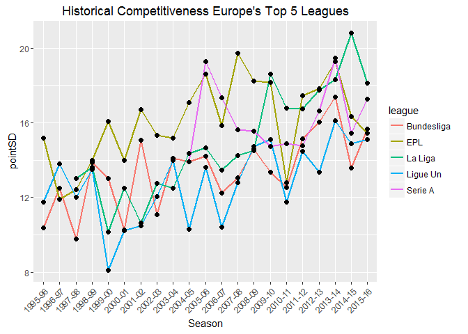
A few notes on the graph: the number of teams in Serie A (highest division in Italy) increased from 18 to its current 20 in the 2004-05 season (I excluded the seasons prior to the change); 18 teams compete in the Bundesliga 1 (highest division in Germany), the remaining leagues have 20 teams. With the exception of the Italian league, all leagues show a significant decrease in competitiveness (assuming a significance level of 0.05/4= 0.0125- Bonferroni correction, where we’ve conveniently ignored Serie A due to insufficient data and poor model fit).
# coefficients of linear models
all_leagues %>% dplyr::group_by(league) %>% dplyr::mutate(Season = 0:(n()-1)) %>%
split(.$league) %>% purrr::map(~ lm(pointSD ~ Season, data=.)) %>%
purrr::map(summary) %>% purrr::map("coefficients")
## $Bundesliga
## Estimate Std. Error t value Pr(>|t|)
## (Intercept) 11.3022928 0.63387590 17.83045 2.539928e-13
## Season 0.2113859 0.05422168 3.89855 9.660040e-04
##
## $EPL
## Estimate Std. Error t value Pr(>|t|)
## (Intercept) 14.1355880 0.80560178 17.54662 3.388504e-13
## Season 0.1934851 0.06891109 2.80775 1.123236e-02
##
## $`La Liga`
## Estimate Std. Error t value Pr(>|t|)
## (Intercept) 10.8622381 0.63219900 17.181676 3.525341e-12
## Season 0.4507231 0.06000567 7.511341 8.516182e-07
##
## $`Ligue Un`
## Estimate Std. Error t value Pr(>|t|)
## (Intercept) 10.9017099 0.7395403 14.741198 7.472477e-12
## Season 0.1886179 0.0632602 2.981621 7.667278e-03
##
## $`Serie A`
## Estimate Std. Error t value Pr(>|t|)
## (Intercept) 15.86036832 1.0050073 15.7813458 2.144275e-08
## Season 0.06860098 0.1547692 0.4432469 6.670225e-01
# R-squared values for respective linear models
all_leagues %>% dplyr::group_by(league) %>% dplyr::mutate(Season = 0:(n()-1)) %>%
split(.$league) %>% purrr::map(~ lm(pointSD ~ Season, data=.)) %>%
purrr::map(summary) %>% purrr::map("r.squared")
## $Bundesliga
## [1] 0.4444232
##
## $EPL
## [1] 0.2932458
##
## $`La Liga`
## [1] 0.7684562
##
## $`Ligue Un`
## [1] 0.3187537
##
## $`Serie A`
## [1] 0.01926822
Summary
Using a combination of graph theory and more conventional statistics, we’ve shown that Europe’s major football leagues are becoming less competitive. It supports the belief that the gap between the super-rich and the smaller clubs is widening. Now, whether you think this is a good or bad development for the sport probably depends on your club allegiance. However, we can all agree that it’s unlikely a team like Deportivo La Coruna will win La Liga with 68 points in the near future.
Leave a Comment