
Data Scientists vs Data Analysts- Part 1
I decided to start off my blog series with a topic that can be often overlooked within the data science field. What exactly is a data scientist? Specifically, what skills do they possess compared to, say, data analysts? The typical skills of a data scientist has been addressed here (R) and here (Python). However, I’m interested in how this contrasts with similar analytical professions. Rather than relying on our opinions, let’s address the topic in a more quantitative sense.
Data science has undoubtedly exploded in recent years, with data scientist even considered the best job in America. With employers trying to keep up with the current trend, I suspect many data scientists are just renamed data analysts. Part 1 focuses on the top level numbers and pretty visualisations to highlight key differences. Part 2 investigates whether we can predict data scientist jobs based on their job description and spot data analyst jobs masquerading as data scientists (and vice versa).
jobbR
We’re going to use job postings on Indeed for our analysis. Indeed has a free and relatively straightforward API. As there was no existing R wrapper, I created one on github (you can consider this blog post as one big advertisement). You’ll need to get a publisher key if you want to query the API. Getting one is pretty easy (name and email is sufficient).
We’re going to compare data scientists and data analysts jobs in London.
## if you haven't already installed jobbR
# devtools::install_github("dashee87/jobbR")

## loading the packages we'll need
require(jobbR)
require(ggplot2)

# collecting data scientist jobs in London from the Indeed API
dataScientists <- jobSearch(publisher = "yourpublisherID", query = "data+scientist",
country = "uk", location = "london", all = TRUE)

# collecting data analyst jobs in London from the Indeed API
dataAnalysts <- jobSearch(publisher = "yourpublisherID", query = "data+analyst",
country = "uk", location = "london", all = TRUE)
Not all of those jobs are actually data scientist or data analyst positions (research scientists will be included, for example). Let’s restrict our data sets to data scientists and data analysts, respectively (and remove junior/senior/managerial roles).
# removing junior and senior roles
dataScientists <- dataScientists[grepl("data scientist",dataScientists$results.jobtitle,
ignore.case = TRUE) & !grepl("senior|junior|lead|manage|intern|analyst|graduate",
dataScientists$results.jobtitle,ignore.case = TRUE),]

dataAnalysts <- dataAnalysts[grepl("data analyst", dataAnalysts$results.jobtitle,
ignore.case = TRUE) & !grepl("senior|junior|lead|manage|intern|scientist|graduate",
dataAnalysts$results.jobtitle,ignore.case = TRUE),]
The API documentation claims that duplicate job postings shouldn’t have been returned from our API call, but let’s ensure our data set only includes uniques job posts (we’ll use the Indeed jobkey to identify duplicates).
dataScientists <- dataScientists[! duplicated(dataScientists$results.jobkey),]
dataAnalysts <- dataAnalysts[! duplicated(dataAnalysts$results.jobkey),]
Having tidied up the data, we can now perform some exploratory analysis.
# number of job posts per role
lapply(list(dataScientists, dataAnalysts), nrow)
## [[1]]
## [1] 188
##
## [[2]]
## [1] 202
I’m a little surprised by that. I thought there would have been significantly less data scientist positions (relatively newer and more technical role).
Salary
Who earns more money? Unfortunately, the Indeed API doesn’t return any salary details. To get around this, the jobbR package scrapes salary figures from the job description webpage. Of course, many jobs don’t actually advertise any salary amounts, so we won’t have a complete data set here.
# get salary figures for all data scientist positions
dsSalary <- lapply(dataScientists$results.url, function(x)getSalary(x,"GBP"))
dsSalary <- do.call(rbind, dsSalary)

# get salary figures for all data analyst positions
daSalary <- lapply(dataAnalysts$results.url, function(x)getSalary(x,"GBP"))
daSalary <- do.call(rbind, daSalary)

# quick look at our salary dataset
head(daSalary)
##      status  period currency minSal maxSal
## 1 Permanent    year      GBP  27000  30000
## 2   unknown unknown      GBP     NA     NA
## 3 Permanent    year      GBP  32042  36548
## 4   unknown unknown      GBP     NA     NA
## 5   unknown unknown      GBP     NA     NA
## 6 Permanent    year      GBP  45000  50000
That function is not perfect, so it may warn that NAs were introduced by coercion. We need to filter out the jobs for which no salary figures could be retrieved. Also, let’s restrict the analysis to jobs with annual salary numbers.
# filtering out jobs with no advertised salary or retaining those with annual salaries
dsSalary <- dsSalary[! is.na(dsSalary$minSal) & dsSalary$period=="year",]
daSalary <- daSalary[! is.na(daSalary$minSal) & daSalary$period=="year",]

# number of positions with an advertised annual salary
lapply(list(dsSalary, daSalary), nrow)
## [[1]]
## [1] 69
##
## [[2]]
## [1] 75
Job postings often advertise a salary range. We want a single figure for each job, so we take the midpoint of this range.
dsSalary$Sal <- mapply(function(x,y){(x+y)/2}, dsSalary$minSal, dsSalary$maxSal)
daSalary$Sal <- mapply(function(x,y){(x+y)/2}, daSalary$minSal, daSalary$maxSal)
We can now plot the cumulative distribution of salaries for data scientists and data analysts. We just need to append a label to each group and merge the data frames.
dsSalary$type <- "Data Scientist"
daSalary$type <- "Data Analyst"
ggplot(rbind(dsSalary, daSalary), aes(Sal, colour = type)) + stat_ecdf(size = 1) +
geom_text(size=8, aes(100000, .3, label = "Data Analyst", color = "Data Analyst")) +
geom_text(size=8, aes(100000, .2, label = "Data Scientist", color= "Data Scientist")) +
labs(title = "Annual Salary: Data Analysts vs Data Scientists",
x = "Annual Salary (GBP)", y = "Cumulative Proportion") +
theme(axis.title = element_text(size = 14,face = "bold"),
plot.title = element_text(size = 16,face = "bold"), legend.position = "none",
axis.text = element_text(size = 11))
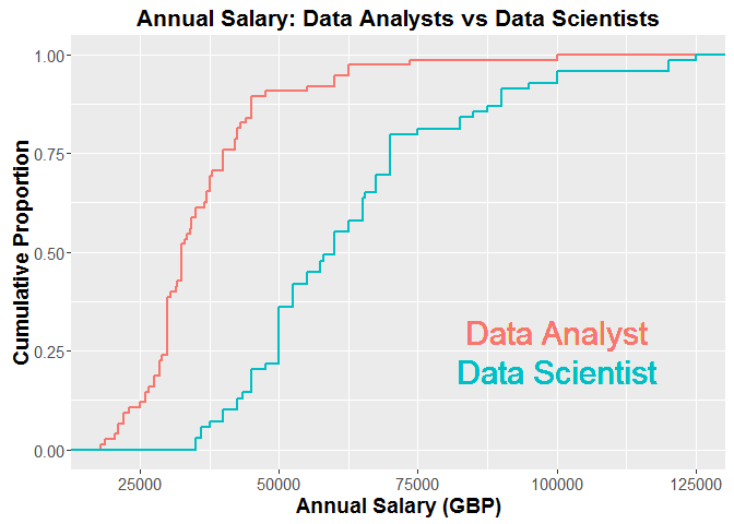
From the plot, it’s clear that data scientists earn significantly more money than their data analyst counterparts, which is not particularly surprising to me. According to the graph, the median annual salary for a data scientist is approximately £60,000, which is higher than I expected (remember, we removed senior/manager roles). Then again, we only have data for jobs where the salary was advertised. Maybe high salaries are more likely to be publicised.
Summary
We’ve extracted job data from the Indeed API (using the jobbR package), cleaned it up and produced a simple graph to illustrate the salary gap between data scientists and data analysts. Part 2 will focus on the job descriptions and use natural language processing to predict data scientist and data analyst positions based on their advertised skill set.
I’ve posted the R code here. Before you move onto Part 2, you could investigate how data scientists compare to data engineers, data architects, quantitative analysts, etc. Or you can check where your salary fits on the distribution of your profession. Hopefully, you don’t now feel grossly underpaid (I certainly do).
Thanks for reading! Please post your comments below!
Leave a Comment